INTRODUCTION
-
-
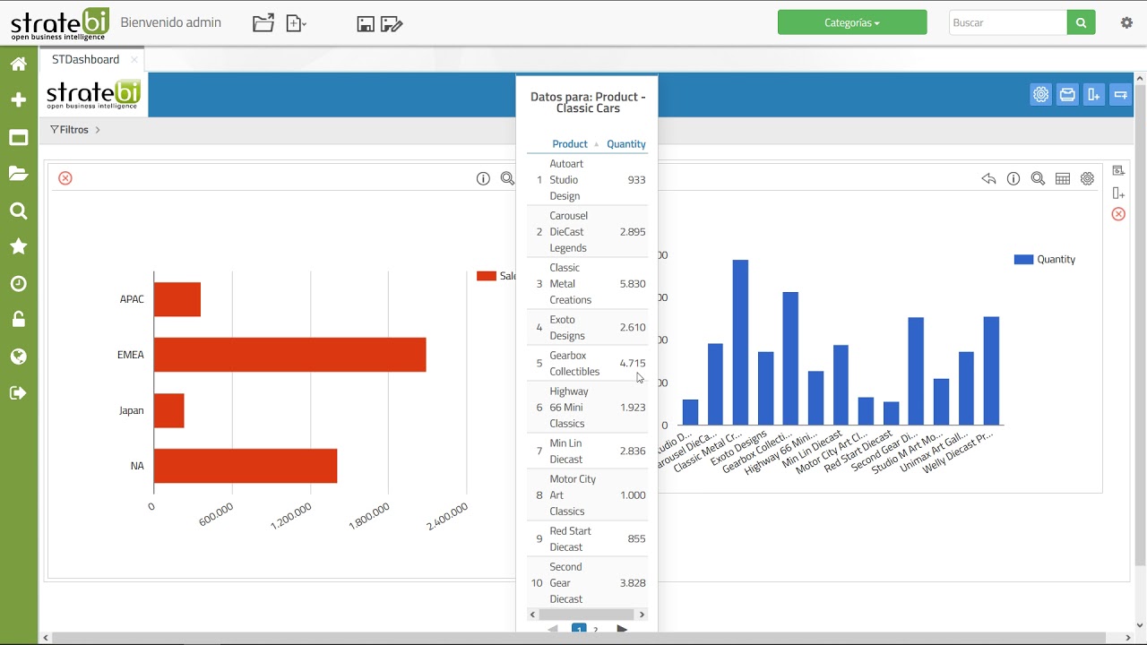
STDashboard is an open source tool developed by StrateBI for the definition of scorecards. Its objective is to allow the end user to interactively create a scorecard of sencillay quickly, efficiently, without the need for additional knowledge (programming, design, knowledge of the organization's business).
You can also choose predefined templates.
STDashboard has the objectives:- Who is the end user who can define their own charts, without the need to resort to a third department (department of computer science, department of development, etc). In addition, the way to create these tables is intuitive, fast and simple way, so that the learning of the use of the tool is almost immediate.
- Provide different types of graphs and tables to present data in the most appropriate manner for the user.
- It is a good complement to the ad-hoc dashboards which can be created with CDE (Pentaho Commnunity Dashboard Editor).
-
-
-
STDashboard users will find a set of features, among which we highlight:
- Easy creation or editing of a dashboard.
- Different templates for dashboards.
- Simple interface for graphic configuration.
- Advanced Options.
- Add external content.
- Filters to limit graphics data.
-
VIDEO TUTORIALS
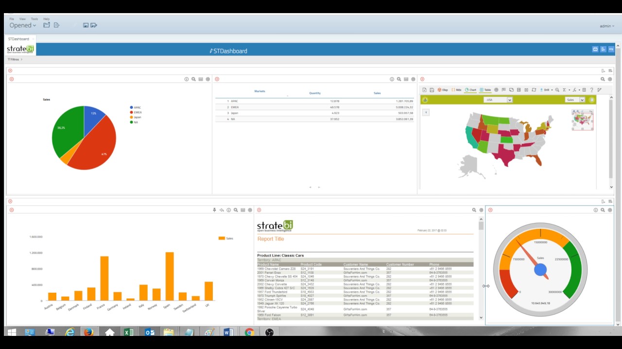
Dashboard for end users in minutes
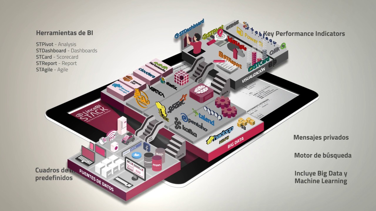
LinceBI open Source BI/Big Data solution
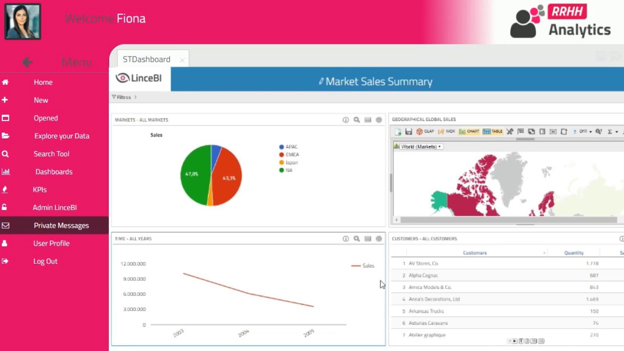
LinceBI vertical dashboarding solution

Cubes, schemas and templates management
Config, PDF export and layouts
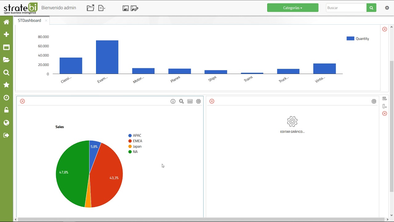
Graphs, measures and dimensions
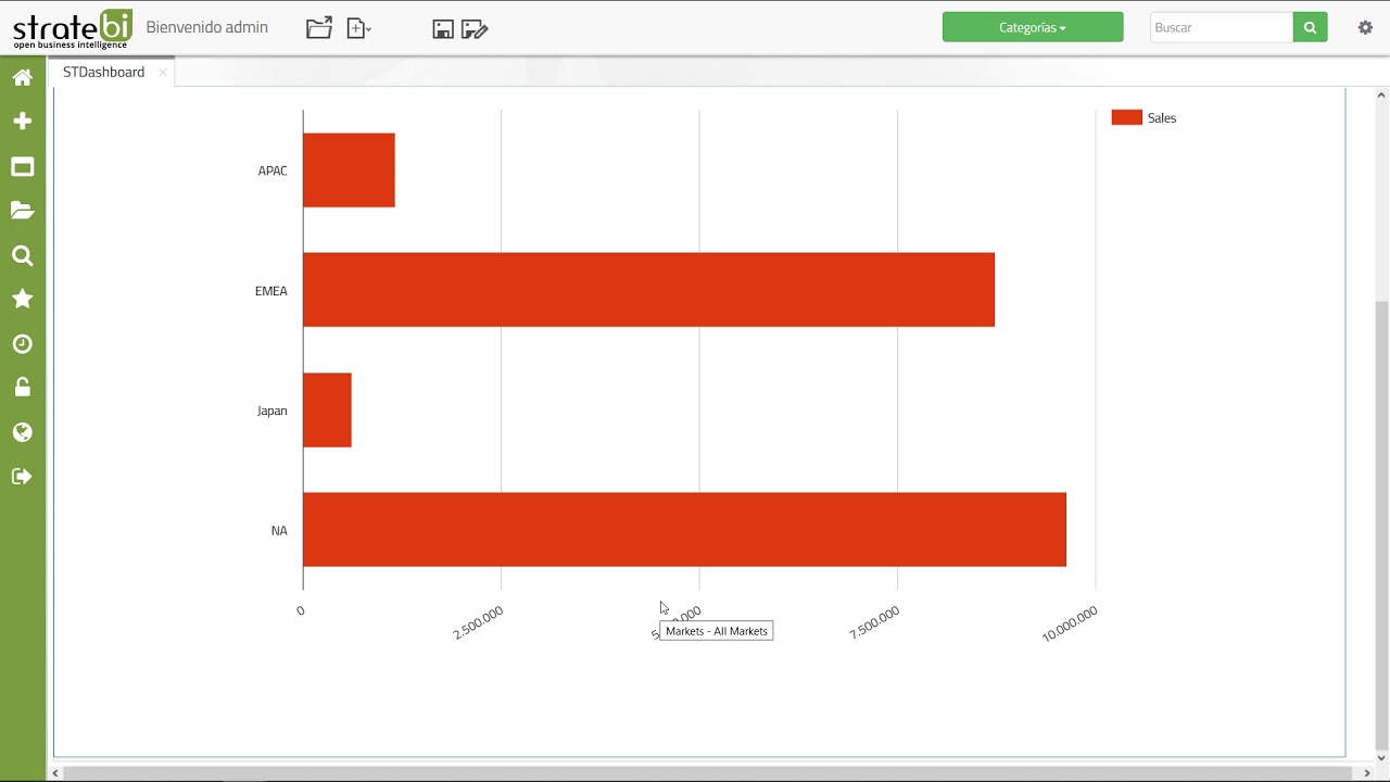
Drill through, drill up and filters
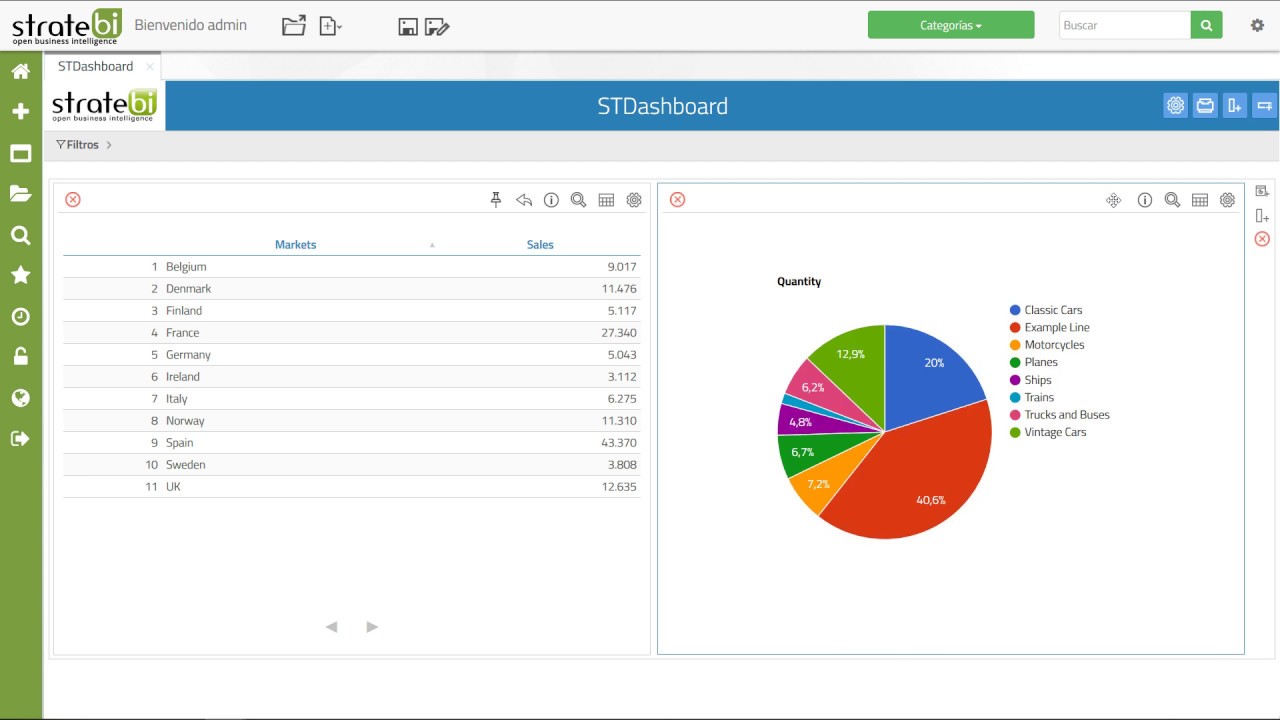
Fix panel and filter between panels
Customizations, graphs and external content
